inhetit
studio
UX Product
design
figma design systems
Accessibilty
©2026
UX Product
design
accessibilit
Figma design
systemS
Figma design systemS
With deep expertise in variables, library architecture, and scalable Figma structures, I specializein multi-brand and white-label solutions. I ensure that each brand maintains its unique identity while operating within a shared, efficient design system.
USER CENTRICITY
A forward-thinking, empathetic, and open-minded approach that takes into account potential comprehension problems and stumbling blocks for the user from the outset is the essence of my work. I am proficient in accessible design and user journey.
AI-ENHANCED PRODUCT DESIGN
I integrate advanced AI tools to accelerate workflows, improve design quality, and explore
more comprehensive solution spaces to deliver faster iterations, smarter concepts, and product experiences that leverage the full potential of today’s AI-driven design landscape.
work
work
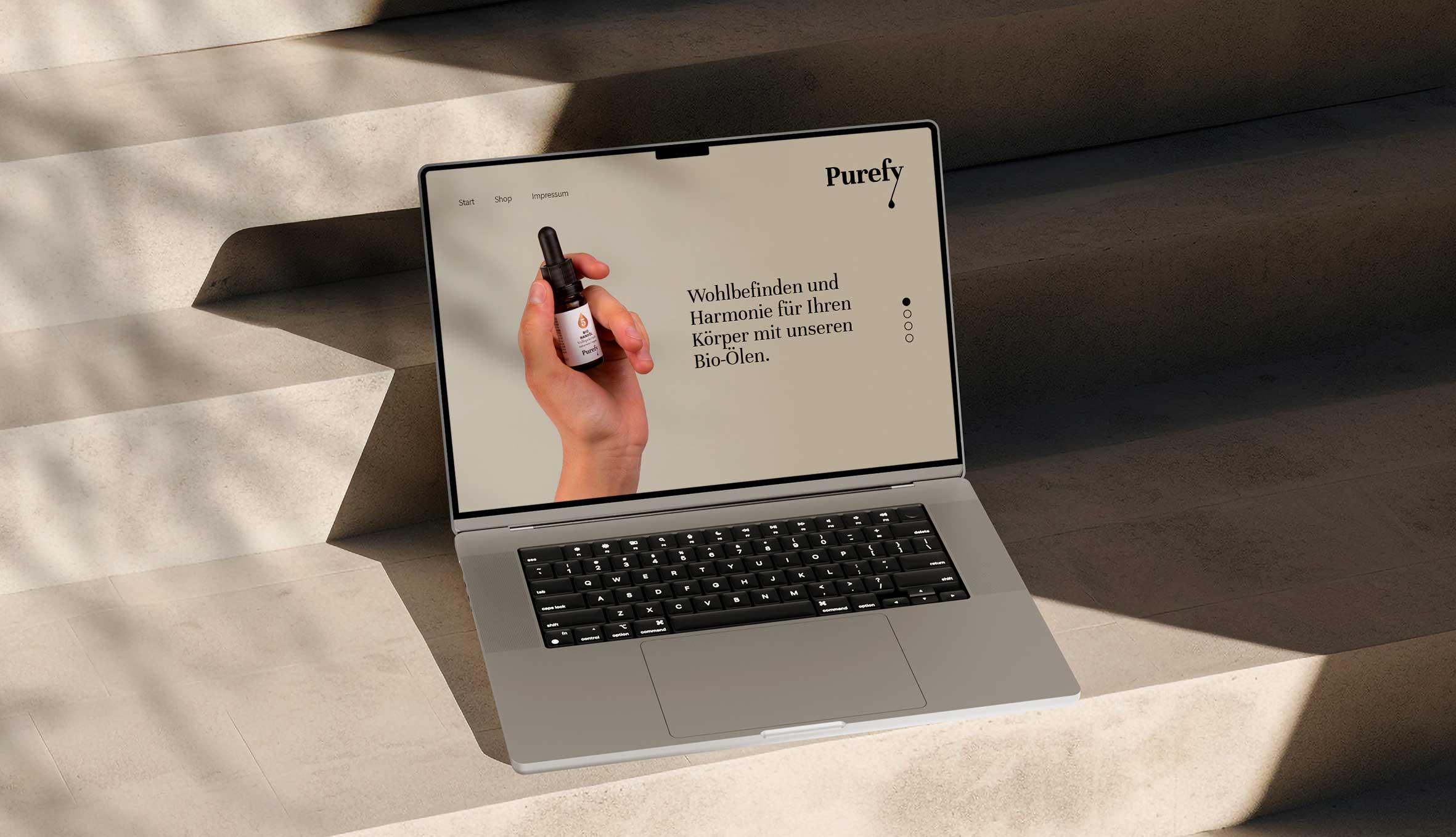

Purefy
Purefy is a startup that distributes high-quality organic oil. The most important property of the identity was the visual accent on the high quality of the oil – grace, purity and health are the central topics.
03 — Work: Design System
MultibranD
Design Systems
We build highly scalable design systems that ensure brand consistency, effortless switching between styles, and accessibility from the start. Behind that easy switch sits a complex token architecture: rigorous underneath, easy for designers and developers to navigate, and ready to be AI-enhanced whenever it helps.
Choose a brand
Accessibility
Body · Surface
14.0:1 AAA
Text · Colour
10.0:1 AAA
Accessibility
Body · Surface
14.0:1 AAA
Text · Colour
10.0:1 AAA
Accessibility: more than contrast.
The accessibility of a digital product is multifaceted and complex, it depends just as much on a solid interaction hierarchy as it does on the right wording and a finely tuned color scheme.
- Contrast — text & controls against their background, APCA- and WCAG-checked.
- Weight & size — hair-thin type and 9px labels fail before contrast does.
- Colour hierarchy & meaning — colour must carry the right signal and never carry it alone.
- Information architecture — an order, grouping and structure a screen reader can follow.
- Interaction hierarchy — one clear primary action, not buttons shouting at once.
- Labels & semantics — real labels, not floating placeholders that vanish.
- Focus & keyboard — every control reachable and visibly focused, no mouse.
- Error & UX writing — say what's wrong and how to fix it.
about
SUSANNE KOMOREK
founder
Susanne Komorek is the founder of inherit studio For the past two years, she has been part of the agile team behind Germany's largest multi-brand design system. Behind that sit 16+ years across industries and company sizes — from public broadcasters to startups to independent artists.
She studied Visual Communication at the University of Applied Sciences in Mainz and started out in branding and web design. Then the smartphone changed everything — and Susanne went with it: from building brands to engineering the systems that keep them consistent and accessible across every screen.
Her branding roots are exactly why I'm good at the hard part of multi-brand systems: keeping every identity intact while the whole thing scales. She is a Figma power user with a real technical foundation — HTML, CSS, JavaScript, React, Tailwind — so my systems survive contact with engineering. And she builds accessibility in from the first token, not the last audit.
Originally based in Berlin, she now works and lives internationally, commuting between Asia and Europe.
16+
Years of Experience
UX/UI
Accessibility
FIGMA
Design System Superhero